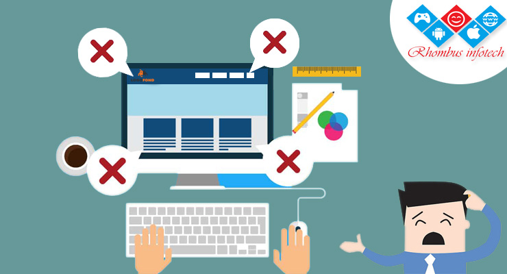
Web design and website creation can be fun, but too often the user experience can be compromised by focusing too much on how a website looks and less on how the website should function. Users will be quick to switch to your competitor the moment your website becomes a chore to navigate. So, to help you avoid losing potential traffic here’s a quick guide as to what to avoid doing, and what you should do instead when piecing together your new website.
404 Pages
Throwing up a generic, out-of-the-box, 404 page could be hurting your traffic. A simple 404 page can result in users simply hitting the “back” button and completely leaving your website with very little chance of them returning. The simple fix for this is to give users options should they reach a 404 page along with a brief explanation as to why they may have reached such an error. Provide links to your “Home” or “About” pages. If users feel like they have an alternate path to take with some reassurance as to what triggered the error, then they will be less likely to hit the back button.
Image Size
Images are a must with a website, otherwise, it will be nothing but text, making for a lackluster user experience. What you have to be mindful of is the size of the images you’re uploading. The larger your images, the slower your website will load, leading to a significant impact on your Google ranking and users that do find your site will quickly be tapping the back button as your website struggles to load. Be sure all of your images are heavily compressed before uploading.
Embrace Web Design Norms
It might be tempting to breakaway and dive deep into some new trendy design that goes against the norm, and sometimes it works, but you have to keep your audience in mind when making such a decision. Menus and page layouts appear similar across a lot of websites simply because it is what users have come to expect from a website. Sure, it would be fun to do something different and have a navigation menu at the bottom of the screen, but if users struggle to navigate your site, they will quickly leave and head to a site that caters to their expectations of what a website should look like.
Colors and Fonts
Having a legible website sounds like an obvious one, but surprisingly many sites appear to forget this simple rule. This goes back the idea of focusing too heavily on the look and not the experience. A pink background with red cursive lettering might look cool, but it’s going to give users an instant headache and cause them to quickly tap the back button. Stick with traditional colors for your fonts and web pages and use the banners and footers to house your branding colors and fonts.
Not Anticipating and Adapting
Users are coming to your website with questions in mind before they even begin navigating. While it might be a bit impossible to predict completely what a user is thinking, there are steps you can take to anticipate what information a user is attempting to obtain from your website. Simple tools such as Google Analytics and HotJar can help show you how users are interacting with your website. By monitoring these interactions, you can get a feel for what answers users are searching for and then adapt your website to help answer those questions quickly and easily for those users.